
CSS Media Queries
Nowadays it is very common by the user community to access any website using laptop /desktop/mobile/etc., (different sizes of the devices). So, it is very much important to any website to be accessed using smaller/larger/different sizes of devices. Search engines also giving higher ranks/preferences to websites that are very much responsive. Search engines give lower ranks to websites that are not responsive. CSS media queries are very useful to develop responsive websites.
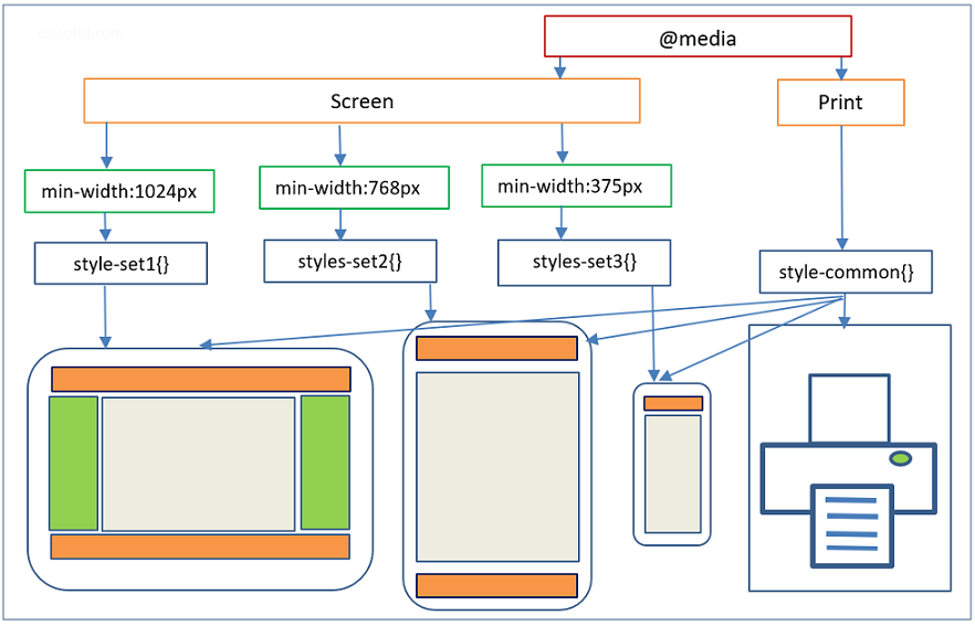
Media queries apply to styles to elements based on media/device type (ex. screen, print) or some other specific characteristics with parameters (ex. max-width: 768px).
Media query syntax
@media  [not|only]  <media type>  [and (<one or more features>)] {
   <CSS code>
}
Note:
- Features can be specified with “and” / “or” (means “,”) / “not”.
- If no media type is specified then the system takes ‘all’ as the default media type.
@media (min-width:500px) {..}
@media all and (min-width:500px) {..}
Above, both lines of code have same meaning and give the same output.
Media query syntax has four sections.
Section 1: @media (keyword required).
@media screen and (max-width:1024px){..}Section 2: not/only (optional).
@media not print {..}Note: ‘ONLY’ keyword is used to prevent old/non-media query supporting browsers to apply styles.
Section 3: Media type – all/screen/print/speech (optional, ‘all’ is default).
@media screen and (max-width:1024px){..}- ‘all’ applicable for all the devices.
- ‘screen’ applicable for all the screens (ie, desktop, laptop, tablets, mobile phone screens).
- ‘print’ applicable for any type of printers and print preview mode.
- ‘speech’ applicable for speech synthesizers.
- Media type is used to specify where(all/screen/print/speech) to apply styles.
Section 4: One or more features (at least one feature is required).
@media screen and (min-width: 600px) and (max-width: 1024px) {..}Set of predefined media features are available. Each specifies some characteristics of the user agent (user agent is a software which acts on behalf of a user. ex: web browser) and output device.
“width” media feature with min and max prefixes are explained.
@media screen and (width: 1024px){} => media type = screen and width =1024px.
@media screen and (min-width: 600px){} => media type = screen and minimum width >=600px.
@media screen and (max-width: 1024){} => media type = screen and minimum width <=1024px.
Few media features and it’s definitions with examples are listed below.
1. width (min & max prefix applicable. ex. width, min-width, max-width)
- Width of the viewport which includes width of the scrollbar.
@media (width:1024px) {..}
@media (max-width:1024px) {..}
2. height (min & max prefix applicable)
- Height of the viewport.
@media screen and (max-height:1366px) {..}3. orientation
- Orientation(portrait/landscape) of the viewport.
@media screen and (orientation: landscape) {..}4. resolution (min & max prefix applicable)
- Pixel density of the output device.
@media screen and (min-resolution:72dpi) {..}5. aspect-ratio (min & max prefix applicable)
- Width to the height aspect ratio of the viewport.
@media screen and (min-aspect-ratio:16/9) {..}Setup different style sheets based on different media.
Using @media rule, setting up element style is a very common way.
The following other options also there to attach style sheets based on media type and other features.
- Using Link element
- Using @import rule
Examples to include style sheets based on media type and other features using Link element.
Example 1:
<link rel="stylesheet" type="text/css" media="screen and (max-device-width: 480px) " href="small-device.css" />Link element attaches small-device.css style sheet when media type = screen and maximum device width <= 480px.
Example 2:
<link rel="stylesheet" type="text/css" media="screen and (max-width:1024px), print and (max-width:780px)"
href="screen-print.css">
Link element attaches screen-print.css style sheet to two media rules (comma separated). First rule is media type = screen and maximum width <= 1024px. Second rule is media type = print and maximum width <= 780px.
Example 3:
<link rel="stylesheet" type="text/css" media="print" href="print-styles.css">Link element attaches print-styles.css style sheet when media type = print.
Example 4:
<link rel="stylesheet" media="screen and (color)" href="screen-color.css" />Link element attaches screen-color.css style sheet when media type = screen and should be a color device.
Example 5:
<link rel="stylesheet" media="print and (min-width: 25cm)" href="print-styles.css" />Link element attaches print-styles.css style sheet when media type = print and minimum width = 25cm.
Note: Including CSS file through the Link element is generally a preferred way.
Examples to import style sheets based on media type using @import rule.
Example 1:
@import "screen-styles.css" screen;Import screen-styles.css style sheet when media type = screen.
Example 2:
@import "screen-print-styles.css" screen, print;Import screen-print-styles.css when media type = screen or media type = print.
Example 3:
@import url(screen-color.css) screen and (color);Import screen-color.css style sheet when media type = screen and should be a color device.
Example 4:
@import "tablet-style.css" screen and (max-width: 768px);Import tablet-style.css style sheet when media type = screen and maximum width <= 768px.
Different media queries examples.
Example 1:
@media screen and (min-width:1024px){
   body{
    font-size:19px;
   }
 }
In the above example, style is applicable to body element when media type = screen and minimum width >= 1024px (viewport width).
Example 2:
@media print and (max-width:794px){
      body{
           margin:2em;
           color:#000;
           background-color:#ffffff;
        }
}
In the above example, styles are applicable to body element when media type = print and max width <= 794px.
Example 3:
@media screen and (min-width: 400px) and (max-width: 700px) {
    p {
        padding-bottom:5px;
    }

    #heading {
        text-align:center;
        font-weight:bold;
    }
}
In the above example, styles are applicable to different (P, #heading ID) elements when media type = screen and minimum width >= 400px and maximum width <= 700px.
Example 4:
@media screen and (max-width: 680px), screen and (orientation: landscape) and (max-width: 768px) {
    #nav {
        display:none;
    }}
In the above example, same style is attached to two media rules (comma separated). First rule is, media type = screen and maximum width <= 680px. Second rule is media type = screen, orientation = landscape and maximum width <= 768px.
Example 5:
@media not print {
    @media (max-width:1024px)  {
        body {
              background-color:red;
		}
    }
}
In the above example, one media rule created inside another media rule. Here style is applicable to body element when media type != print and maximum width <= 1024px.
Example 6:
@media not all and (max-width: 767px) {
    div {
        padding: 10px;
        font-size:15px;
        }
}
In the above example, do not apply styles to DIV element when media = all and maximum width <= 767px.
Example 7:
@media screen,print {
    body {
	line-height:1.4em;
    }
}
In the above example, same style is attached two simple media rules. One media rule is media type = screen and another media rule one is media type = print.