
Relative unit (%)
Relates to base or parent element font size.
Note: Browsers default font size is typically 16px.
Example 1: Set font size to DIV element content using relative unit (%).
div {
    font-size:50%;
}
Above example sets 50% of the parent element font size to DIV element content. If no font size is specified to the parent element then system will take default typical font size 16px of the browser.
Example 2: Set width to DIV element using relative unit (%).
div {
   width:60%;
}
Above example sets 60% of the browser window width to DIV element. Browser window width varies based on screen size.
Example 3: Apply % unit to DIV elements properties (font size, line height, width).
<!DOCTYPE html>
<html>
<head>
    <title> CSS % unit </title>
    <style>
        body {
            font-size:100px;
        }
        div {
            font-size:50%;
            line-height:200%;
            border:1px solid green;
        }
        div.clsWidth {
            width:60%;
        }
    </style>
</head>
<body>

    <div> font size 50px , line height 100px (Parent element)
        <div> font size 25px  , line height 50px (Child element)
            <div> font size 12.5px , line height 25px (Grandchild element)</div>
        </div>
    </div>
    <div class="clsWidth">
        This DIV element width is 60% of the total browser window width.
    </div>
</body>
</html>
Result:
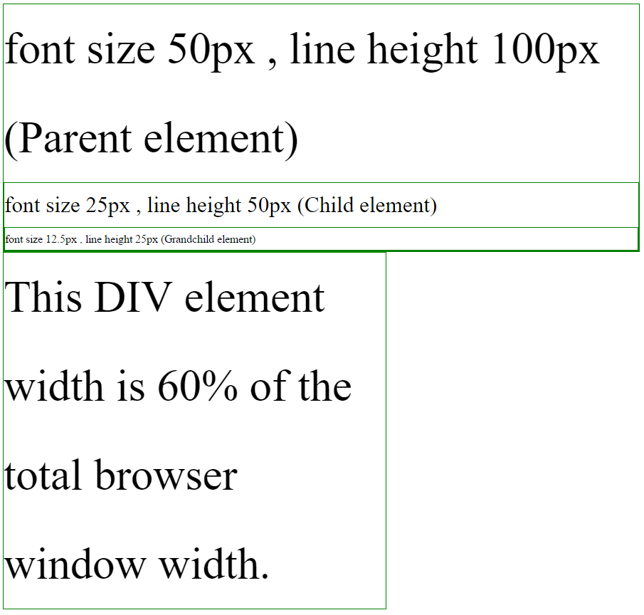
In the above example,
- Body element font size is 100px.
- First DIV element font size is 50% of the parent element. Here parent element is BODY element. 50% of the font size equal to 50px (100px * 50%).
- Second DIV element is child of first DIV element. 50% of the font size is equal to 25px (50px * 50%).
- Third DIV element is child of second DIV element. 50% of the font size is equal to 12.5px (25px * 50%).
- Last DIV element width is 60% of the browser window width.