
Relative unit (rem)
Relates to root element (HTML element) font size.
Ex: 2 rem = root element (HTML element) font size * 2
Example: Apply rem unit to font size and line height properties of the DIV elements.
<!DOCTYPE html>
<html>
<head>
    <title> CSS rem unit </title>
    <style>
        html {
            font-size:25px;
        }
         div   {
            font-size: 2rem;
            line-height: 4rem;
            border: 1px solid green;
        }

    </style>
</head>
<body>
    <div >
        First Line  (Parent)
        <div> Second line (Child) </div>

    </div>
    <div> Third line</div>
</body>
</html>
Result:
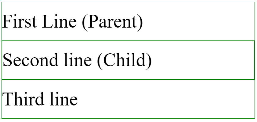
In the above example,
- Root element (HTML) font size is 25px.
- Here three DIV elements are available.
- Second DIV element is a child element to the first DIV element.
- First and third elements are in same level.
- All DIV elements font size (2 * 25px = 50px) and line heights (4 * 25px = 100px) are applied based on the root element (HTML) font size (25px).