
35 CSS tips
There are various ways to understand, learn and use CSS. Following CSS tips also could be very helpful to understand, learn and use CSS effectively.
1CSS Syntax
CSS syntax has three parts. Those are Selector, Property and Value.

p {color:blue;}“P” – Selector. Here Selector is a P element.
“Color” - Property
“Blue” - Value
2How CSS Selectors work?
Selectors are very important in CSS. Different CSS Selectors are there to apply styles to HTML elements.
When apply styles using Selectors, two steps are followed.
- Find element using Selector.
- Apply styles to selected element.
p {color:blue;}“p” – Selector. Here, Selector is a P element and it is called Element Selector.
“color:blue” – Style. This style is applied to P element.
3Preferential Style sheet usage
Better to use internal or external CSS styles instead of inline CSS.
4Universal Selector overrides default and inherited properties
Universal selector(*) sets properties to each element of the page. It overrides default and inherited property values.
* { color:blue; }Above example sets text color blue to all elements of the page.
div * {
        color:red;
    }
Above example sets text color red to all elements which are inside the DIV element.
5CSS inheritance
Many element properties are inherited from Parent element(ex: body background color applies to many child elements).
body {
        background-color:red;
    }
Above example sets background color RED to body element. Same background color inherited to its many child elements (ex: p, div) but not all child elements(ex: textbox, checkbox).
6More specific CSS selectors
Use more specific CSS selectors instead of less specific CSS Selectors to get better performance.
<!—- 1) Less specific selector -->
      div > p + div > p {
         color:red;
    }
<!—- 2) Less specific selector (improved comparing 1)  -->
       div >  div > p {
         color:red;
    }
<!—- 3) specific selector(introduced CSS class) -->
      .sub-para {
         color:red;
    }
<!—- HTML portion -->
<div>
<p>Para 1</p>
<div class="sub-para">
<p>P1.1</p>
<p>P1.2</p>
</div>
</div>
In the above example all three styles implementations do the same job. But third style(.sub-para) implementation gets better performance since system needs to search and style based on particular selector instead of check all the selectors (from right to left order).
7Static elements don’t respect few properties
Static position elements don’t respect left, right, top and bottom properties.
    p {
        position: static;
        left:100px;  /*doesn't apply when position is static*/
        top:60px; /*doesn't apply when position is static*/
    }
    div {
        position:static;
        right:-200px; /*doesn't apply when position is static*/
        bottom:-50px; /*doesn't apply when position is static*/
    }
8Inline elements don’t respect few properties
Inline HTML elements respect padding left and right properties only. It doesn’t respect padding top and bottom properties.
span {
        color:blue;
        padding-left:100px; /*apply*/
        padding-right:100px; /*apply*/
        padding-top:100px; /*doesn't apply for inline element*/
        padding-bottom:1000px; /*doesn't apply for inline element*/
    }
<body>
<div>Div element1</div>
<span>Span element</span>
<div>Div element2</div>
</body>9Inline HTML elements respect margin left and right properties only. It doesn’t respect margin top and bottom properties.
span {
        color:blue;
        background-color:yellow;
        margin-left:100px; /*apply*/
        margin-right:100px; /*apply*/
        margin-top:100px; /*doesn't apply for inline element*/
        margin-bottom:100px; /*doesn't apply for inline element*/
}10Inline CSS styles get first preference
Inline CSS styles get first preference to apply. But inline CSS styles to be avoided or used less.
<div style="background-color:lightgreen;border:1px solid red" >Message</div>11Internal CSS styles get second preference
Internal CSS styles get second preference to apply.
<style type="text/css">
    div {
        background-color:lightgreen;
        border:1px solid red;
    }
</style>
<div>Message</div>12External CSS styles get third preference
External CSS styles get third preference to apply.
<head>
   <link rel="stylesheet" href="corestyles.css"/>

   <title> CSS External Style </title>
</head>13CSS !important property overrides default preference patterns
!important property to be used with care. System overrides default preference patterns(inline, internal and external CSS) and gives first preference to this property.
div {
        border:1px solid red !important;
}14Obsolete and Deprecated HTML elements
Be aware of Obsolete and Deprecated HTML elements and attributes.
15CSS media queries
Based on screen size, different CSS properties can be applied using @media queries.
@media only screen and (min-width: 1280px) {
            .tableResp {
                display: table;
                border-collapse: collapse;
                width:98%;
                padding:5px;
            }

}16CSS Dynamic units
In screen, try to use dynamic units (ex: %,px) instead of fixed units.
div{
         position:relative;
         left:100px;
         width:50%;
}17CSS Fixed units
Fixed units(ex: cm) can be used for printing purpose.
.page-prop {
        margin:2cm;
}18CSS Default font size
Default font size is typically 16px for most of the browsers.
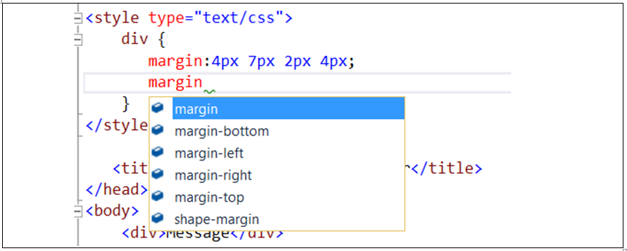
19CSS Shorthand properties
Shorthand (padding:10px) properties can be used instead of longhand version properties(padding-left:10px, padding-right:10px etc.).
/*CSS Shorthand version*/
div {
    border:1px solid red;
}
/*CSS Longhand version*/
div {
    border-width:1px;
    border-style:solid;
    border-color:red;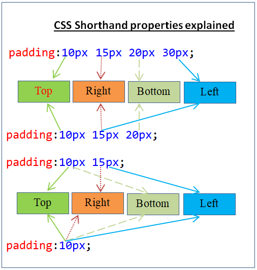
}20CSS Shorthand properties applicable order
Following are shorthand properties applicable order.
a) When four values available,
- First value applies to top.
- Second value applies to right.
- Third value applies to bottom.
- Fourth value applies to left.
div {
        padding:10px 15px 20px 30px;
    }
b) When three values available,
- First values applies to top.
- Second value applies to right and left.
- Third value applies to bottom.
div {
        padding:10px 15px 20px;
    }
c) When two values available,
- First value applies to top and bottom.
- Second value applies to right and left.
div {
        padding:10px 15px;
    }
d) When one value is available,
- Same value applies to all four directions.
div {
        padding:10px;
    }
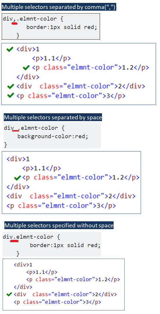
21Different CSS Selectors combinations
Selectors combinations get different meanings.
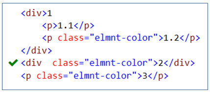
a) Multiple selectors separated by comma(“,”) - Same styles are attached with multiple selectors.
div,.elmnt-color {
       border:1px solid red;
    }
Here the same border style is attached with two selectors(DIV, .elmnt-color’).
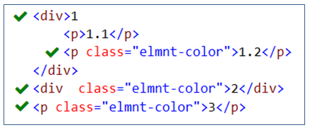
b) Multiple selectors separated by space – Styles are applied to child elements of the parent element. These are called descendant selectors.
div .elmnt-color {
    background-color:red;
}
Here border style is applied to CSS class(.elmnt-color) applied elements which are child elements of DIV element.
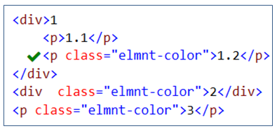
c) Multiple selectors specified without space - Styles are applied to elements which meet all the combinations.
div.elmnt-color {
        border:1px solid red;
    }
Here border style is applied to CSS class(.elmnt-color) applied DIV elements only.
22Generic font-family usage
When specify multiple font-family, it is advisable to specify Generic font-family as a last item. This will help to use Generic font if no font is installed.
font-family:Arial,"Helvetica Neue",Helvetica,sans-serif;23All browsers rendering result will not be same
Many web(IE, Chrome, Firefox, Opera, etc.,) browsers are there. Web content rendering(result) will not be same for all the browsers.
24Block level element vs Inline element
By default, block level elements(ex: DIV,P) occupies entire row and inline elements(ex: SPAN) occupies based on content width.
<body>
    <div>DIV element</div>
    <span>SPAN element 1</span>
    <span>SPAN element 2</span>
</body>25How to set Width and Height of Inline elements?
To set width and height to inline elements, need to set block/inline-block value to display property of the inline element.
span {
      display:inline-block;
      border:1px solid red;
      width:150px;
      height:250px;
}26CSS Sprites
CSS Sprites (Multiple images added to one image) will reduce number of server requests and network bandwidth. It will improve web site performance.
27CSS Margin doesn’t have color
a) No way to set separate color to Margin area (it is just empty space with Transparency = 0)
b) Margin color simply follows parent element color.
28CSS only for Client side styling not for Server side operations
CSS only for styling not for any data manipulations (insert, update, delete, list). It is not connected with any DB or Server side programming.
29CSS Specificity
Specificity is to determine which CSS rules to be applied to an element by the browser. When more than one Selectors are applied to an element then those who have highest specificity is applied.
30CSS3 support color formats
CSS3 supports different color format(RGB, HEX, RGBA, HSL, HSLA).
RGB - Red Green blue (supports CSS2 and CSS3)
HEX - Hexadecimal (supports CSS2 and CSS3)
RGBA - Red Green Blue Alpha (supports CSS3)
HSL - Hue Saturation Lightness (supports CSS3)
HSLA - Hue Saturation Lightness Alpha (supports CSS3)
div {background-color:rgb(255, 216, 0); }  /*RGB color*/
p { background-color:#ff0000 ; } /*Hexadecimal(HEX) color*/
p {color:rgba(0, 255, 0, .8); } /*RGBA color*/
31CSS debugging through browser’s debugger tool
CSS debugging can be done easily using browser’s debugger tool.
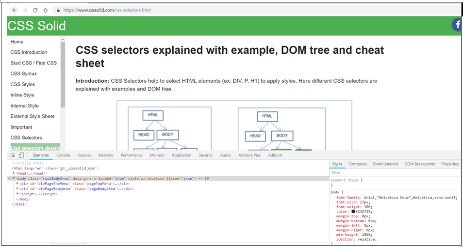
Note: Above image shows(at bottom side) debugger tool of Chrome browser. It opens when press F12 on Chrome browser.
32CSS Margin:auto property
Margin:auto property is used to center the block level element.
div {
       background-color:green;
       margin:auto;
       width:100px;
}33Block elements within Inline elements should not be used
Block elements within Inline elements should not be used. Those wouldn’t work.
<!-- Incorrect: -->
<span><p>Hello</p></span>
<!-- Correct: -->
<p><span>Hello</span></p>34CSS Media queries for Responsive web design
CSS Media queries are useful to build Responsive web design. Responsive website renders web pages well(automatically adjust, resize) on any device and any size of screen(ex. mobile, laptop, tablet and desktop).
@media only screen and (min-width: 1280px) {
            .tableResp {
                display: table;
                border-collapse: collapse;
                width:98%;
                padding:5px;
            }
            .rowRespHeading {
                display: table-row;
                font-weight:bold;

            }

  }
 @media screen and (max-width: 1280px) {
                .tableResp,.rowRespHeading {
                display: block;

                }
                .rowRespHeading {
                    font-weight:bold;
                }

}35DIV vs Table elements
Better to use DIV element instead of Table element to get flexibility and responsive design.