
Relative unit (vh, vw, vmax, vmin)
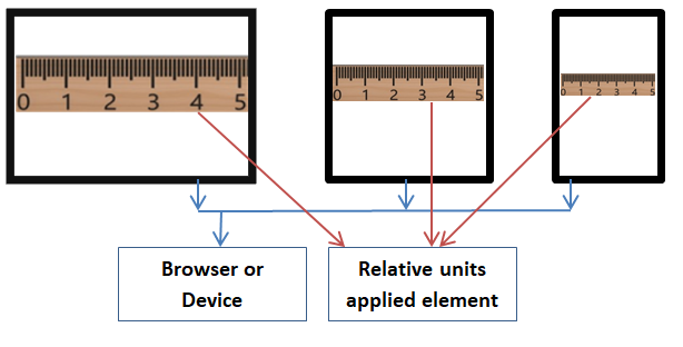
Relative units works based on parent element length. Relative units applied element adjusts lengths based on its parent element length. Parent element could be an another element or browser.
vh – Assign 1% viewport height to the element.
vw – Assign 1% viewport width to the element.
vmax – Assign 1% of larger unit of vh or vw to the element.
vmin – Assign 1% of smaller unit of vh or vw to the element.
What is viewport?
Viewport denotes visible area of the browser window size. When resize the browser window, viewport size also changes.
For example, if one viewport width is 640px and height is 480px then,
1vw = 1 * (640/100) = 6.4px
1vh = 1 * (480/100) = 4.8px
1vmax = 1 * (640/100) = 6.4px
1vmin = 1 * (480/100) = 4.8px
Note: Above units can be applied to any applicable properties (ex., font size, line height, padding, border etc.,).
Example: Apply vh, vw, vmax and vmin (v = viewport) units to the HTML elements.
<!DOCTYPE html>
<html>
<head>
    <title> CSS Viewport units </title>
    <style>
        .clsP1 {
            font-size:5vh;
        }
        .clsP2 {
            font-size:5vw;
        }
        .clsP3 {
            font-size:5vmax;
        }
        .clsP4 {
            font-size:5vmin;
        }
    </style>
</head>
<body>
   <p class="clsP1">Viewport Height (5vh) applied</p>
    <p class="clsP2">Viewport Width (5vw) applied</p>
    <p class="clsP3"> Viewport Max (5vmax) - vh/vw applied </p>
    <p class="clsP4"> Viewport Min (5vmin) - vh/vw applied </p>
</body>
</html>
Result:
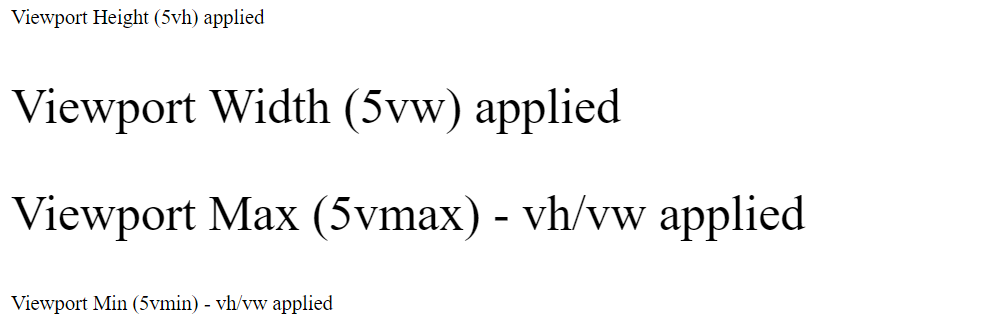
In the above example,
- 5vh (viewport height) is applied to the first P element.
- 5vw (viewport width) is applied to the second P element.
- 5vmax (Larger vw/vh size) is applied to the third P element.
- 5vmin (Smaller vw/vh size) is applied to the forth P element.
Related topics: