
CSS Units
Different types of CSS units are available for expressing lengths. Following table explains different types of CSS units.
| Relative units. | |
|---|---|
|
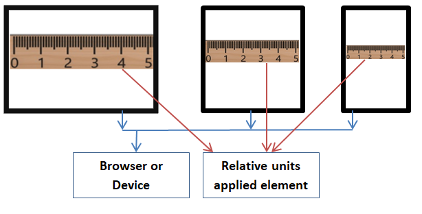
Relative units works based on parent element length. Relative units applied element adjusts lengths based on its parent element length. Parent element could be an another element or browser. |
|
| ‘em’ is a font size. It relates to base or parent element font size. | |
| Relates to base or parent element font size. | |
| Relates to root element (HTML element) font size. | |
| Current font x-height. x-height is equal to lower case character ‘x’ height. | |
| 1 vw (viewport width) equal to 1% of the viewport width. Viewport denotes browser window size. | |
| 1 vh (viewport height) equal to 1% of the viewport height. | |
| 1 vmin (viewport minimum) equal to 1% of smaller length of vw or vh. | |
| 1 vmin (viewport maximum) equal to 1% of larger length of vw or vh. |
| Absolute units. | |
|---|---|
|
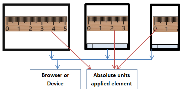
Absolute units are fixed. It is not adjusted based on parent element length. Parent element could be an another element or browser. |
|
| Pixels. 1px is equal to 1/96 of 1in. Even px is absolute unit, it is relative to viewing device. | |
| Points. 1pt is equal to 1/72 of 1in. | |
| Centimeter. | |
| Inch. 1in is equal to 2.54cm. | |
| Millimeters. | |
| Pica. 1 pc is equal to 12 points (pc). |
Note:
- em , px and % are commonly used units.
- If no font size is specified then system will take default font size. Browsers default font size is probably 16px. If browser default font size is 16px then 1em equal to 16px when no other font size is specified at base/parent level.
Relations between some units are given below.
- 1in = 25.4mm = 2.54cm = 72pt = 6pc (Exact values)
- 1in = 6.02em = 96px (Nearly equal values)
Diagrametical way to explain:
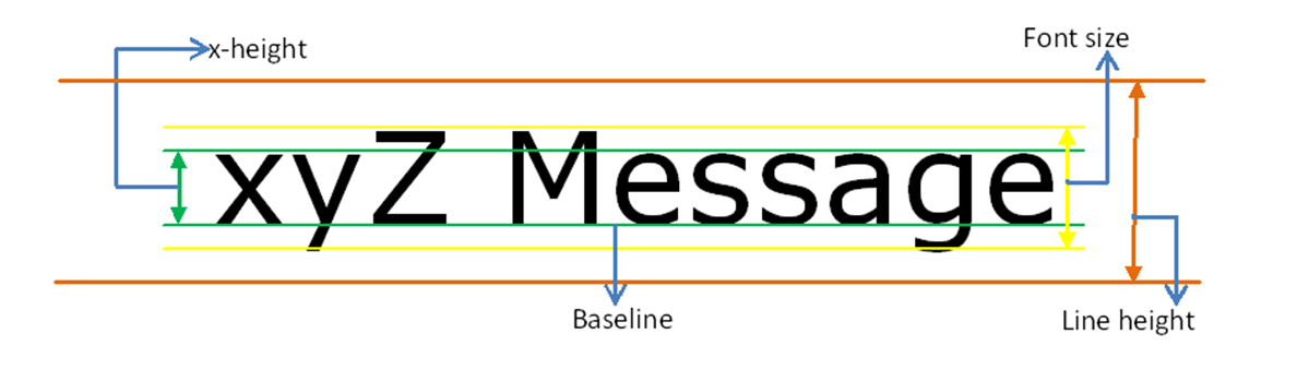
1) Following diagram shows, how system measures font size, line height, baseline and x-height.
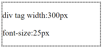
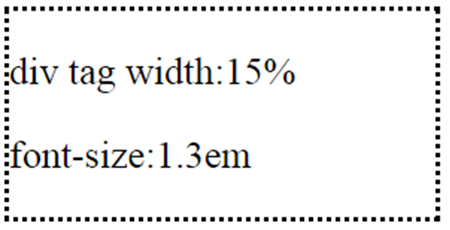
2) Following diagram shows, how system measures.
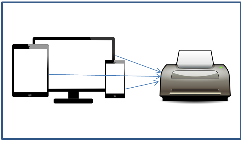
Different devices:
Web pages can be viewed using different types of devices (cellphones, tablets, laptops, PCs). Each device height and width can be different. It is better to use relative units in web pages (for screen use). For printing purpose, absolute size can be used.
Example: Relative and absolute unit behaviors based on screen size or browser window resize.
<!DOCTYPE html>
<html>
<head>
    <title> CSS Relative and Absolute units difference</title>
    <style>
        body {
            font-size:20px;
        }
        p {
            display:inline-block;
            background-color:green;
            color:white;
            padding:20px,0px,20px,0px;
        }

        .infoRelative {
            width:30%;

        }
        .infoDetailRelative {
            width:60%;
        }

        .infoAbsolute {
            width:4.5cm;
        }
        .infoDetailAbsolute {
            width:9.3cm;
        }
    </style>
</head>
<body>

    <div >
        <p class="infoRelative">1) Name :</p>
        <p class="infoDetailRelative"> Brain McCarthy</p>
    </div>
    <div>
        <p class="infoAbsolute">2) Name :</p>
        <p class="infoDetailAbsolute"> Eric Wood</p>

    </div>
</body>
</html>
Result:
1) When normal browser window size,
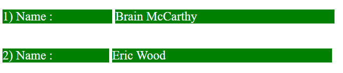
2) When reduce the browser window size,

In the above example,
- Relative units are applied to first row columns.
- Absolute units are applied to second row columns.
- Both rows, columns widths are nearly equal.
- When resize the window, first row columns widths are increased/decreased based on browser size.
- When resize the window, second row columns widths are not adjusted (Units are static) based on browser size.
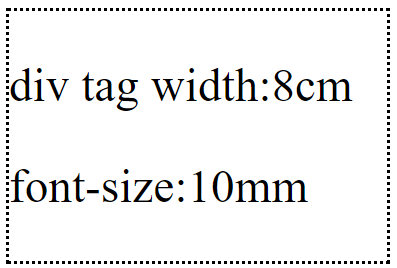
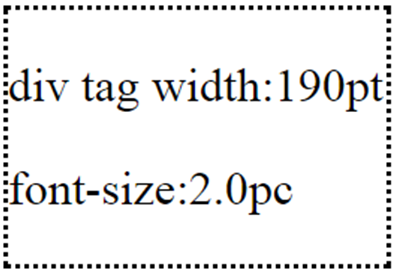
Different CSS unit results are given below:
| CSS measurements | Output |
|---|---|
|
|
|
|
|
|
|
|
|
|
Related topics: